> ## Documentation Index
> Fetch the complete documentation index at: https://docs.marketlens.app/llms.txt
> Use this file to discover all available pages before exploring further.
# Unified Order Flow
If you’ve read [Centralized Exchanges](hhttps://docs.marketlens.app/centralised-exchanges), then you know what limit and market orders are. Order Flow is simply the flow of these orders over time. Order Flow Analysis is the process of finding pattners in order flow data. For example, large limit orders may appear in the order book and seem to protect a certain price level, but as soon as the price approaches them, they get pulled away.
There are many ways to visualize order flow. You can read about some of them [**here**](https://blog.marketlens.app/designing-analytics-and-trading-platform-for-modern-financial-markets). We’ve developed our way to visualize it - Unified Order Flow. Let’s walk you through it.
## Limit Orders
Order Book is a list of bids and asks. Each bid and ask is a pair of a target price level and a quantity of an asset. Some exchanges use the terms “size” and “amount” as alternatives to “quantity”.
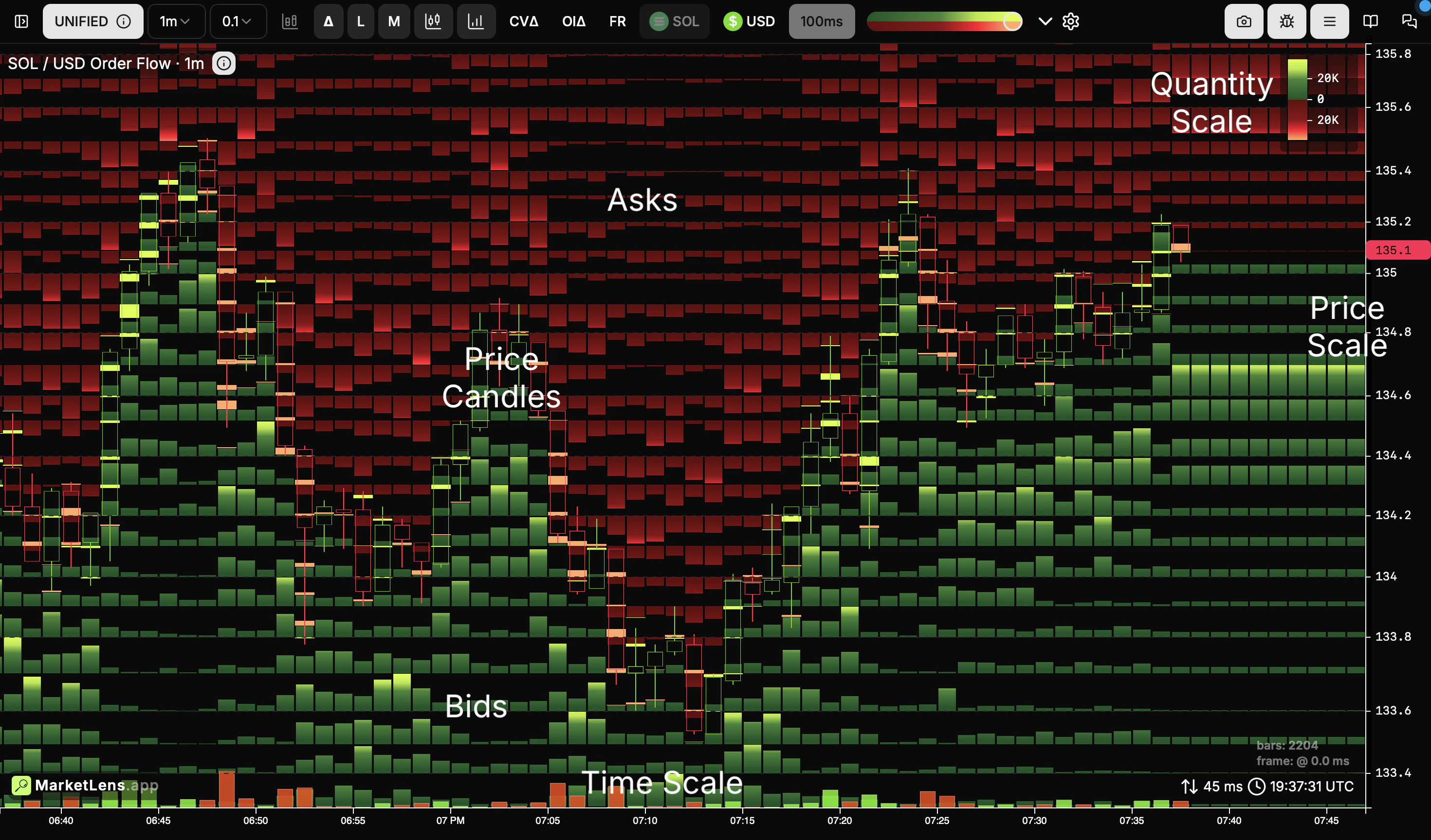 Let’s explore what we see in an example of [Binance SOL/USDT perpetual futures](https://www.binance.com/futures/SOLUSDT), which has a minimum price step of 0.01 and we have price aggregation - 0.1
 The whole space is broken into price ranges, for example, a price range from 134.2 (visible on the right scale) to 134.3 (marker is not shown for compactness). The space inside these ranges shows bar charts. Bars extending upward from the bottom of the range are bids for the lower bound (134.2 in the example) and bars extending downward from the top of the range are asks for the upper bound (134.3). **Every bar is the last bid or ask** **quantity** within the selected timeframe (1m in the example).
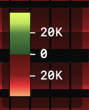 **The heights of the bars are uniform** - N pixels represent the same quantity according to the **quantity scale** in any place on the screen. Color intensities of the bars are here to visuallly distinguish different ranges and bring attention to bigger quantities, where color intensities match those on the quanaity scale legend.
**The Price Scale,** on the other hand, is not uniform - pixel heights between levels may vary depending on vertical space needed to fit bids and asks inside ranges. This may seem unusual; however, from our point of view, it reflects the fact that **price levels are not equally important**and when large quantities separate them it’s logical for them to be distant.
Additionally, this chart shows classic Price Candles, according to the non-uniform price scale.
## Market Orders
The chosen presentation gives an advantage by easily showing market orders, which is not possible on heatmaps.
**The heights of the bars are uniform** - N pixels represent the same quantity according to the **quantity scale** in any place on the screen. Color intensities of the bars are here to visuallly distinguish different ranges and bring attention to bigger quantities, where color intensities match those on the quanaity scale legend.
**The Price Scale,** on the other hand, is not uniform - pixel heights between levels may vary depending on vertical space needed to fit bids and asks inside ranges. This may seem unusual; however, from our point of view, it reflects the fact that **price levels are not equally important**and when large quantities separate them it’s logical for them to be distant.
Additionally, this chart shows classic Price Candles, according to the non-uniform price scale.
## Market Orders
The chosen presentation gives an advantage by easily showing market orders, which is not possible on heatmaps.
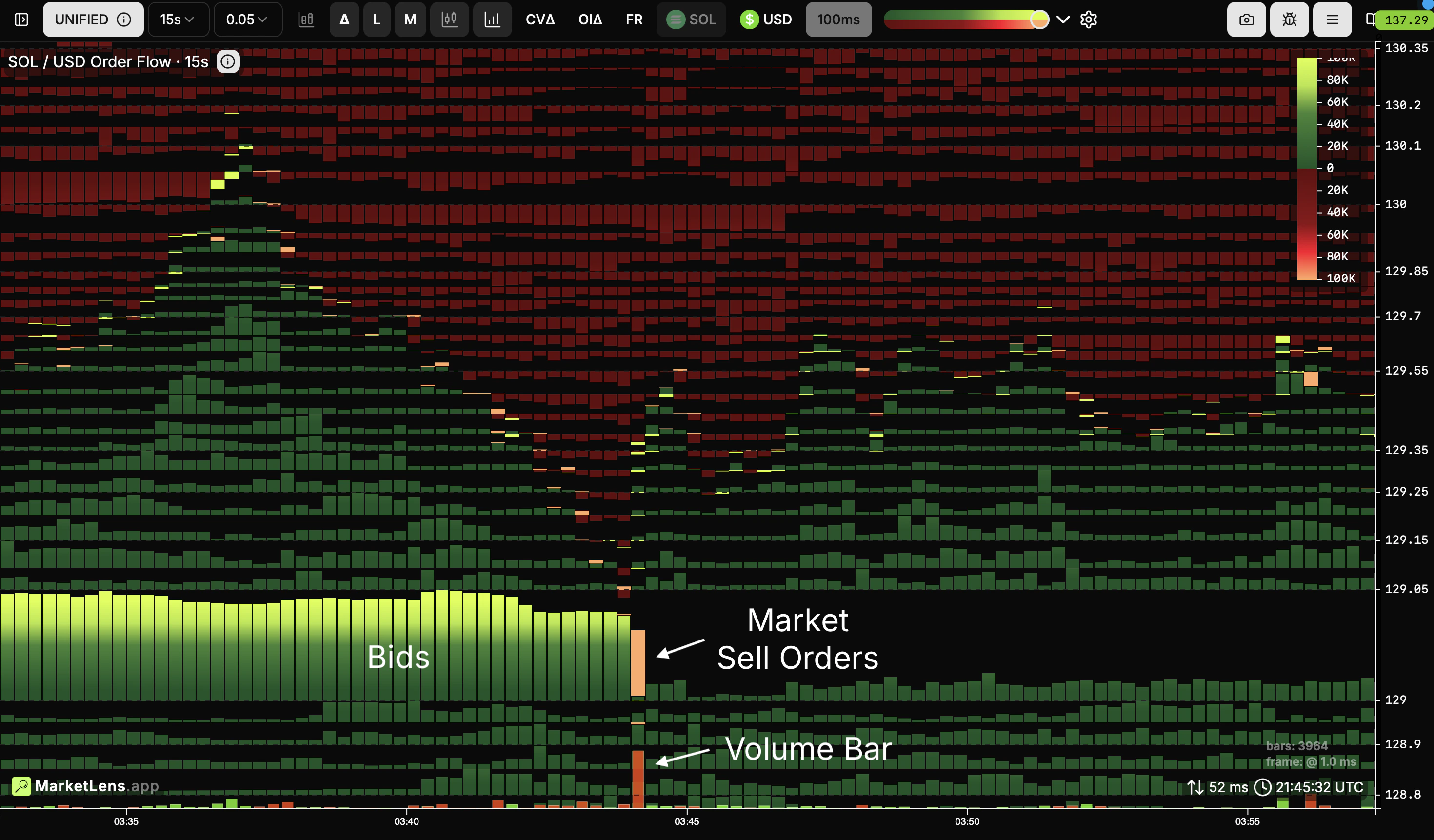 It’s the same SOL/USDT chart with 15s timeframe selected. Here, you can see how market orders cut through limit orders.
 This bar shows that during that 15 seconds, market orders took almost all limit orders at the price of 129.0.
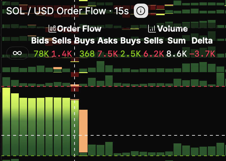
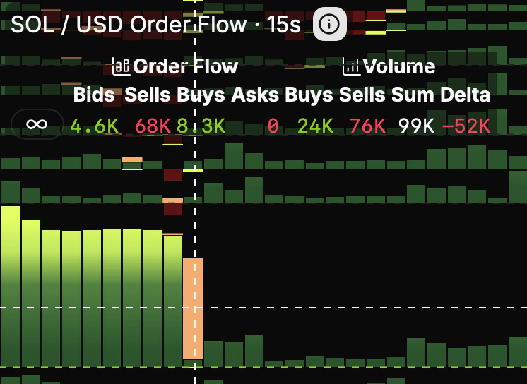 A quick glance at quantity legend let us see that the bid was \~78K SOL and \~68K quantities were taken by market orders.
Market orders are colored red for market sells and green for market buys; they have solid color and no gradient compared to limited orders to bring attention to them.
Additionally, please take a look at volume bars; they have approximately the same heights as the corresponding market orders, as they belong to the same uniform space of order quantities.
## Multiple Markets
Data from multiple markets can be easily combined in a uniform quantity space. Below, you can see Binance and Bybit BTC/USDT perpetual futures shown at the same time. Bids and asks are layered within ranges. Only limit orders are shown for simplicity.
A quick glance at quantity legend let us see that the bid was \~78K SOL and \~68K quantities were taken by market orders.
Market orders are colored red for market sells and green for market buys; they have solid color and no gradient compared to limited orders to bring attention to them.
Additionally, please take a look at volume bars; they have approximately the same heights as the corresponding market orders, as they belong to the same uniform space of order quantities.
## Multiple Markets
Data from multiple markets can be easily combined in a uniform quantity space. Below, you can see Binance and Bybit BTC/USDT perpetual futures shown at the same time. Bids and asks are layered within ranges. Only limit orders are shown for simplicity.
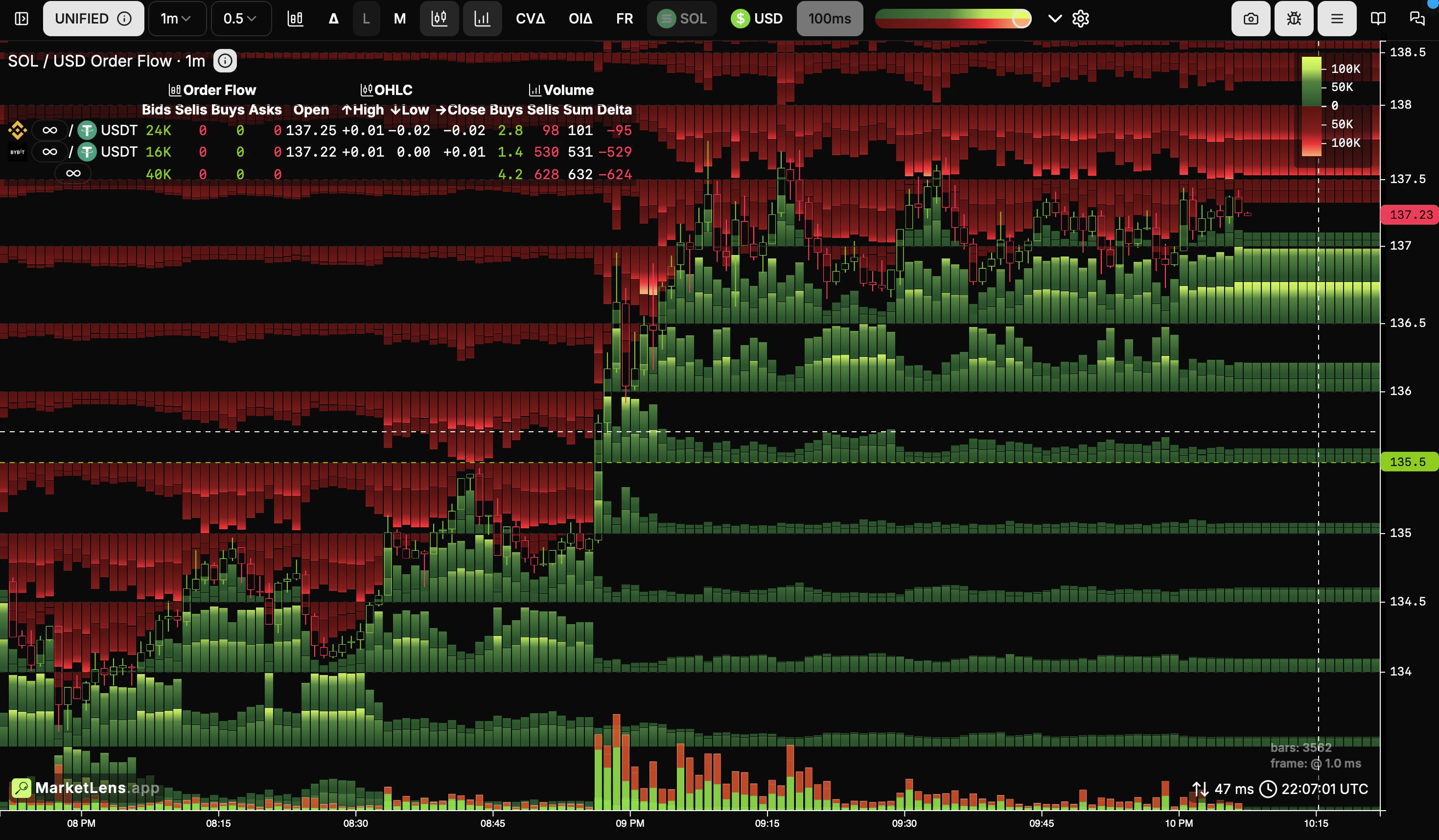 Any selected symbol can be highlighted separately.
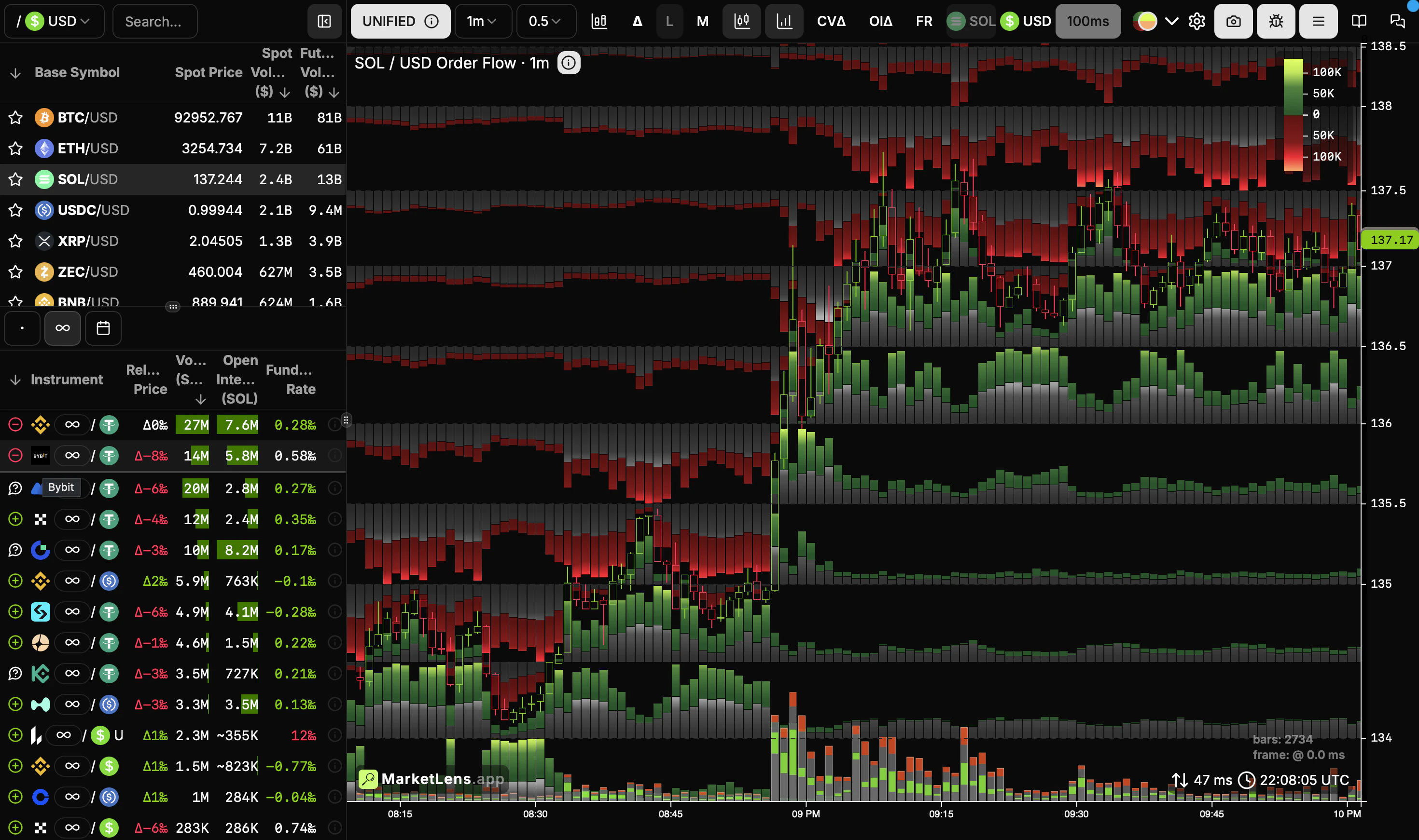 Market orders are aggregated the same way.